
Present information on the organisation’s website so it can be found in three clicks
When creating or updating an organisation’s website, it is important to think not only about design, but also about how quickly a visitor will find the information they need. One practical guide is the so-called three-click rule. It means that the most important content should be accessible not by wandering through many pages, but through a clear and logical structure that lets users find information in just a few steps.
This principle is especially relevant to public-sector organisations in the EU — municipalities, schools, preschools, libraries, museums, cultural centres and other public bodies. On such organisations’ websites, visitors usually look for very specific information: contact details, opening hours, service descriptions, admission procedures, document forms, public procurement, news or legislation. If this information is hidden deep in the menu structure, the user quickly becomes frustrated and the website itself becomes less useful.
What does the three-click rule mean in practice?
This rule should not be understood too literally as a strict technical requirement. Its main point is easy access to information. If a visitor can clearly and without doubt reach the content they are looking for from the home page in a few logical steps, the website structure is appropriate.
For example, on a municipality’s website, a resident should quickly find information about social support, declarations, permits or booking an appointment with a specialist. On a school website, parents should be able to easily access education plans, admissions information, lesson times, contacts and current news. On a library or museum website, a visitor should be able to find opening hours, the events calendar, ticket information or descriptions of educational activities without difficulty.
How do you create a clear website structure?
Convenient navigation starts with a clearly planned menu. The main sections should be easy to understand at a glance and named in the way the target audience actually speaks. Instead of unclear names or labels tailored to the organisation’s internal logic, it is better to use simple words, for example: Services, News, Contacts, Structure, Documents, Frequently Asked Questions.
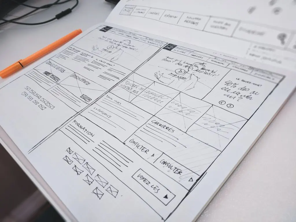
It is also important not to overload the menu. When the main navigation contains too many items, it becomes hard for visitors to decide where to click. It is better to group information into a few clear categories and provide a tidy secondary structure within them. In this way, the website remains orderly and the content is easier to access.
- Highlight the most important information on the home page. The things people look for most often, such as contacts, opening hours, services, registration links or urgent announcements, should be visible immediately. This is especially important for organisations that serve the wider public and receive visitors of different age groups.
- Use clear menu labels. The visitor should not have to guess what a section means. The clearer the labels, the less wandering and the faster the goal is reached.
- Provide internal search. Even on a well-planned website, some users will first look for a search box. This is especially useful on larger websites of municipalities, school networks or cultural institutions, where the amount of content is high.
- Use breadcrumb navigation and a clear page layout. The user should be able to see where they are at any given moment and how to go back. Such solutions help users stay oriented and improve the overall user experience.
Connection with accessibility and compliance with legislation
A clear website structure is important not only for convenience, but also for digital accessibility. Public-sector websites must be understandable and easy to use for everyone, including people with disabilities, older visitors or residents with lower digital skills. If information is hidden too deeply, it becomes difficult to access not only for the average user, but also for those using screen readers or keyboard navigation.
A tidy information architecture also helps to implement requirements relevant to the public sector more effectively. For example, from a GDPR perspective, it is important that the privacy policy, cookie information, data subjects’ rights and contacts for personal data protection are easy to find. Likewise, legislation, corruption prevention information, public procurement, regulations or other documents that must be published should also be easy to access.
The three-click rule is not a formality, but respect for the visitor
A public-sector website must first and foremost serve people. When information is presented clearly, logically and in a way that is quick to access, residents feel that the organisation works transparently, responsibly and with their needs in mind. This builds trust in the organisation and reduces additional administrative burden, because visitors do not need to call or write about something they could easily find themselves.
When planning the website structure, it is worth checking regularly whether the most important information can really be reached in just a few clear steps. If not, it is a sign that the menu, page hierarchy or content layout needs to be simplified. The three-click rule is not just a technical tip — it is the basis of a good user experience, accessible communication and a quality public service online.